Walmart ML-Driven Recommendations
INDUSTRY:
ADTECH
COMPANY:
WALMART
DURATION:
12 MONTHS
ROLE:
LEAD PRODUCT DESIGNER
about.
Walmart Connect Ad Center is an internal platform for first- and third-party sellers to create online and in-store ad campaigns, helping them reach the right customers at the right time. Its core product, Sponsored Search, allows advertisers to feature products and videos directly in Walmart search results, putting them in front of high-intent shoppers.
Historically, Sponsored Search was designed for power users—ad-tech-savvy advertisers who were comfortable navigating the platform and optimizing their campaigns with minimal support. But as Walmart shifted toward expanding its self-serve capabilities for third-party sellers, we anticipated a new wave of less experienced users entering the ecosystem. These users needed more guidance, clarity, and support to effectively manage their campaigns.
I was the lead product designer across this portfolio of initiatives, collaborating closely with 4 PMs across multiple project work steams, 3 main engineering leads, with support from a UX researcher, UX copywriter, and the principal designer from Connect's sister team, Display Self Serve.
Together, we worked to deliver a scalable, user-centered solution that empowered all advertisers, regardless of experience level, to get the most value from their Walmart ads.
challenge.
For many of our newer advertisers, running ad campaigns wasn’t their only job—it was one task among many in the day-to-day of running their business. They often lacked the time, resources, or expertise to dive into reports, analyze performance, and manually adjust campaigns.
I don't have a lot of time to figure out how advertising campaigns are performing. I don't have a lot of time to follow up and see what worked and what didn't.
While Sponsored Search had begun offering in-product, personalized, machine learning-driven recommendations, our research showed that trust and usability were major blockers. Users found the suggestions potentially useful, but the lack of transparency made them hesitate to act.
I wouldn't click apply. I would like to check my campaign first… [I want to] make sure I'm being as efficient as possible.
By you telling me what I need to do without giving me any information on what I'll be getting, that's not relevant.
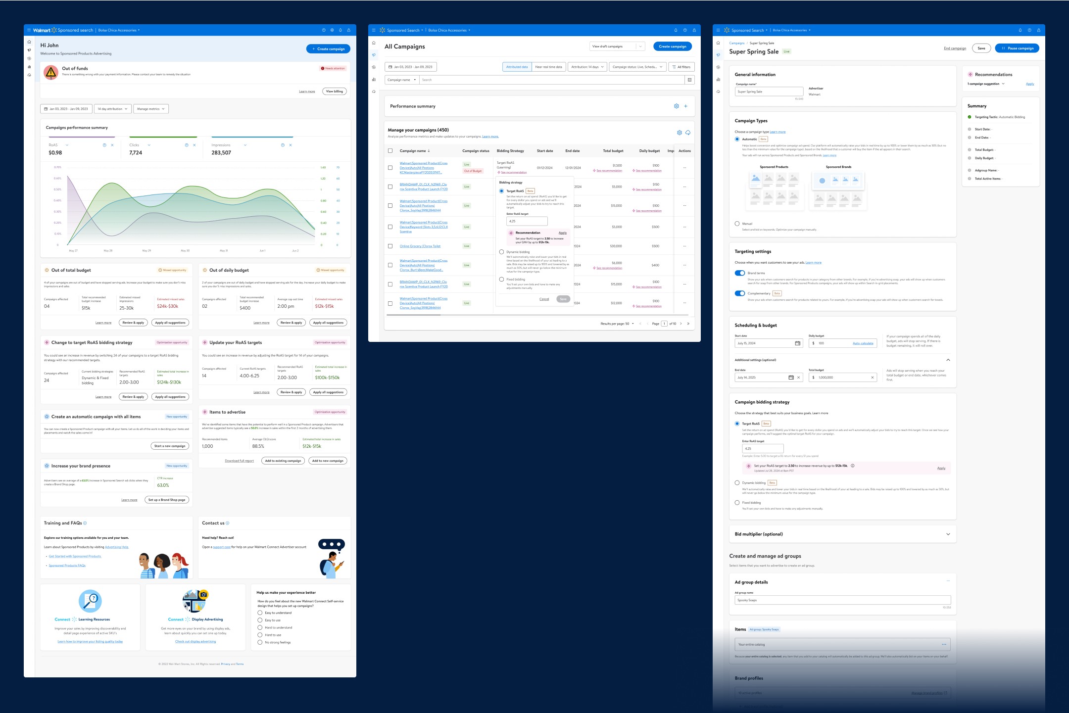
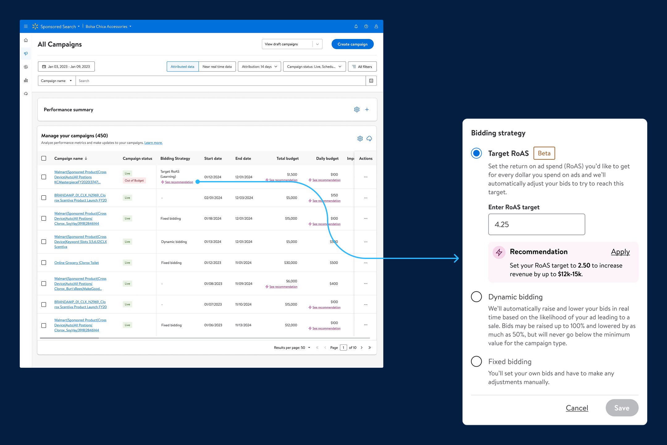
In some cases, the way recommendations were surfaced was actually disruptive to users' core workflows. In particular, the All Campaigns page became a point of friction. Users came here to quickly assess key metrics. However, the way recommendations were integrated (through extraneous table columns dedicated to a single recommendation) disrupted that core task.
These columns:
Pulled focus away from the primary performance metrics
Consumed significant horizontal space, forcing users to scroll or scan more to get to what they cared about
Lost important context since the recommendation appeared disconnected from the control it was related to
As soon as I get to [the All Campaigns page], I am looking at Total Attributed Sales, Ad Spend, and Return on Ad Spend. I want to know how my campaigns are doing and what investments we're getting back. That's always priority number one.
I don't need [those columns]. I just need to see the metrics.
We needed a solution that surfaced relevant guidance without interrupting users’ primary workflow, and that preserved clarity and context at the point of decision-making.


design.
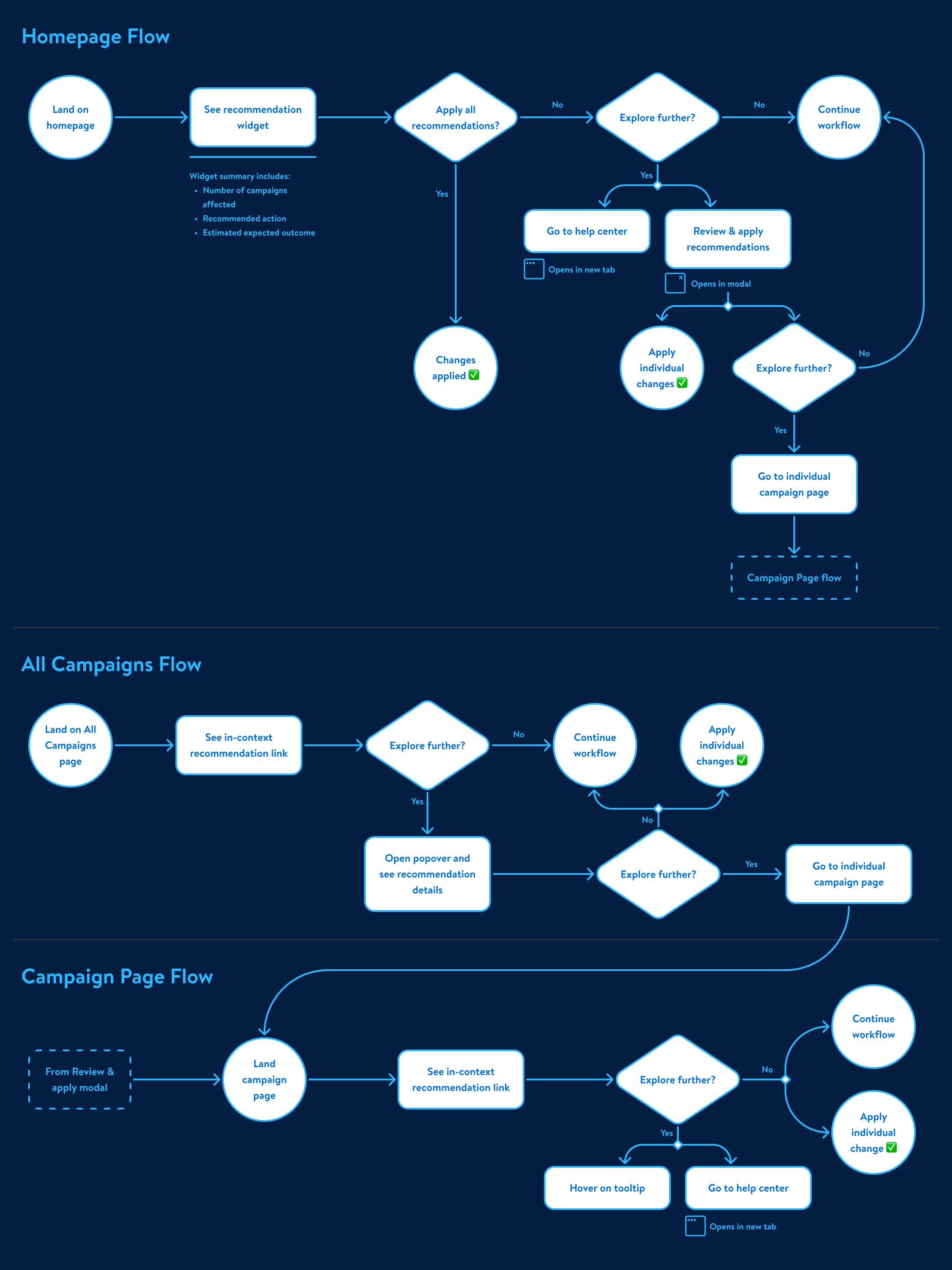
To meet the needs of our evolving user base, I introduced a modular, scalable recommendations system that could guide novice advertisers without disrupting experienced ones. The focus was to ensure that recommendations were:
Contextual: surfaced at the right moment, in the right location
Trust-building: clear, transparent, and easy to inspect
Non-intrusive: respectful of users' primary workflows and goals
Designing for Context, Not Clutter
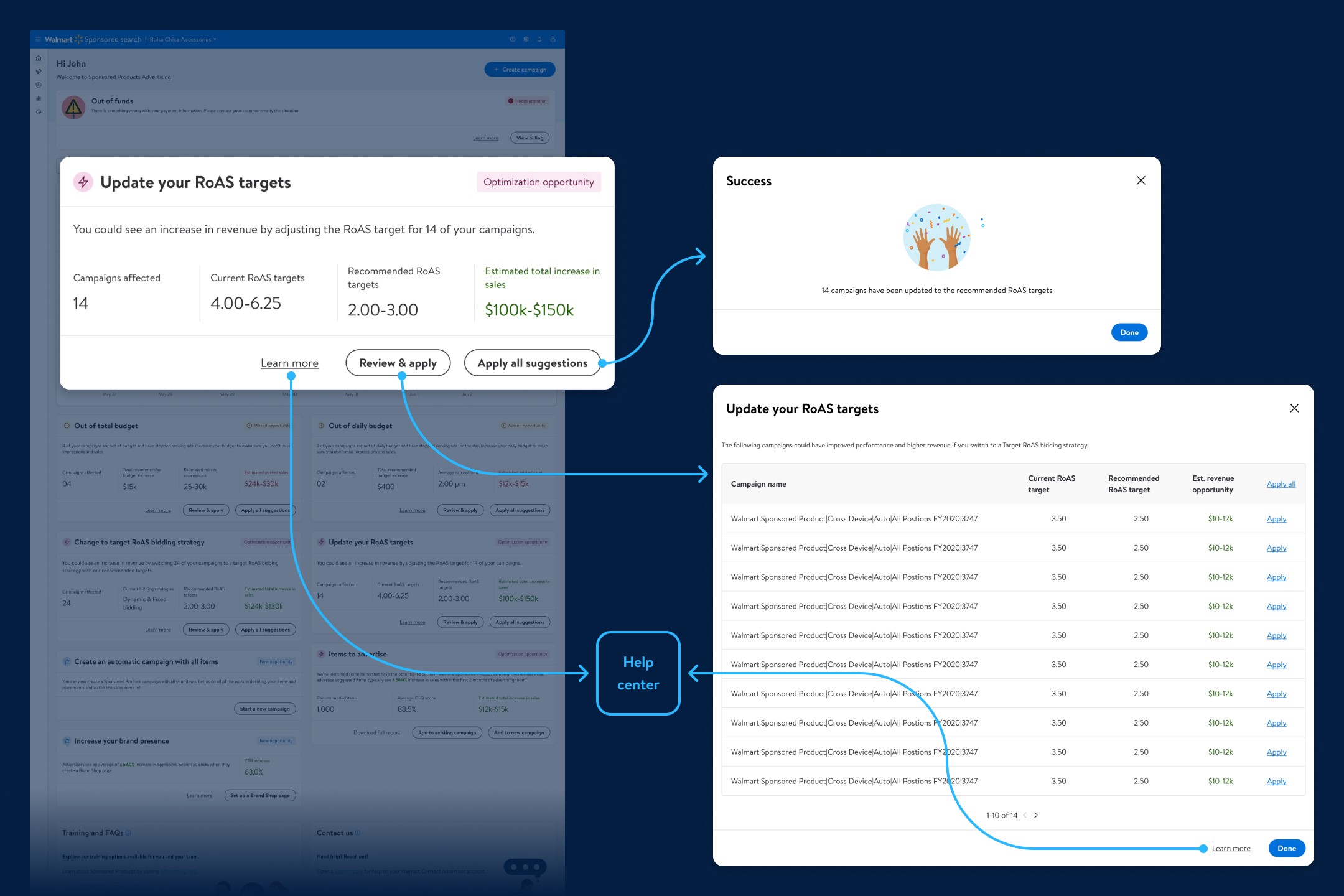
On the All Campaigns page, I removed the extraneous table columns that were cluttering the UI and pulling attention away from core performance metrics. Instead, I used lightweight, in-context links directly within the relevant cell of the affected campaign control.
This approach:
Preserved users’ ability to quickly scan metrics
Made recommendations visible, but not overwhelming
Allowed users to engage with guidance only when relevant to them
Clicking the link opened an editing overlay (a UI already used on this page) with a more detailed view of the recommendation, giving users the clarity and inspection options they asked for, without taking them out of context.
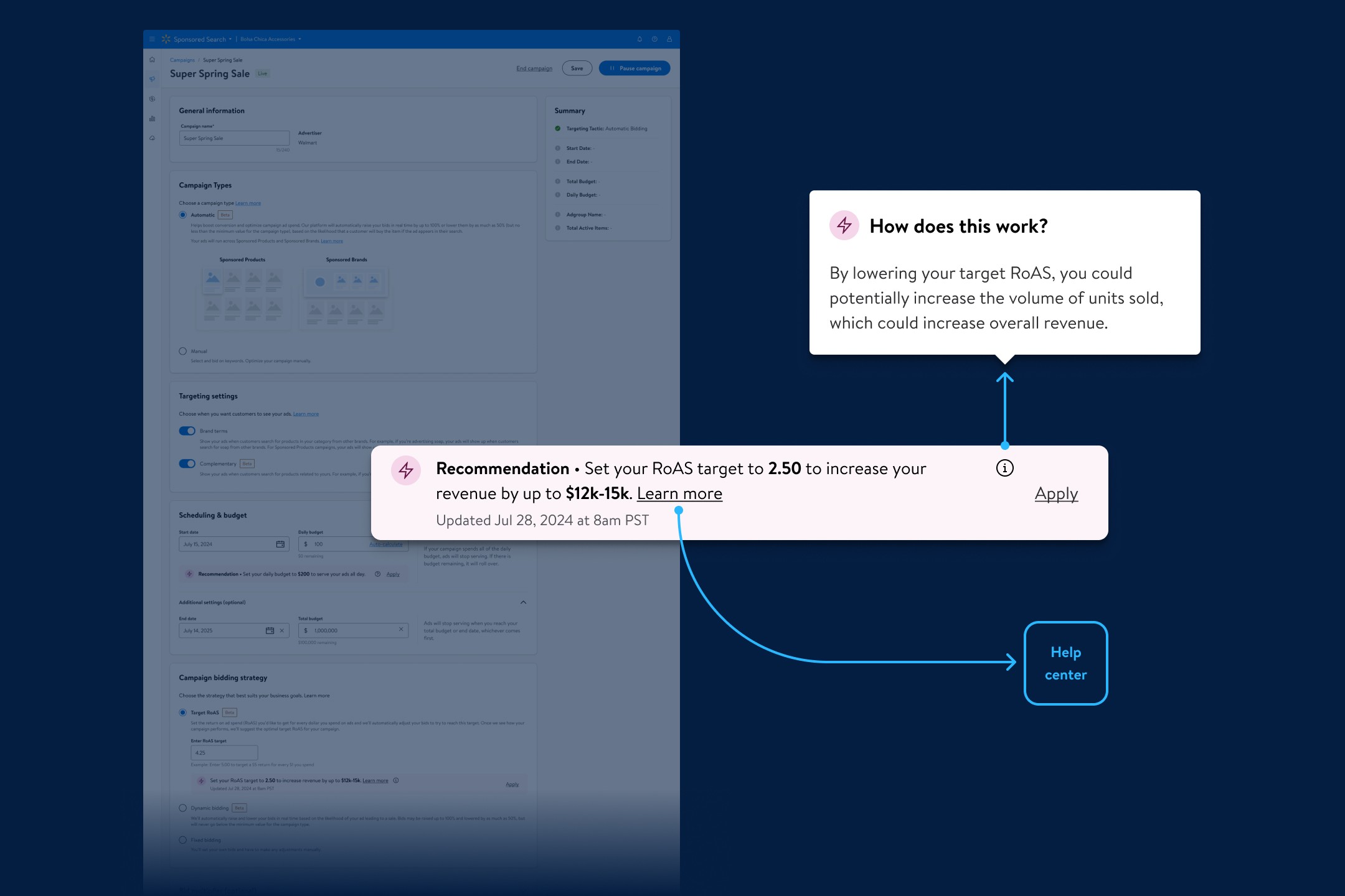
Layering Insight with Progressive Disclosure
Across all surfaces, I applied a progressive disclosure model to deliver value at different levels of depth.
On the Homepage, users could see a high-level overview of the most impactful recommendations, with the option to explore more details or take action directly.
On individual campaign pages, where users were already in an editing mindset, I gave full contextual information about recommendations, supporting decision-making without distraction.
Users could go even further with tooltips or links to the Help Center when they needed additional education or confidence.
Communicating With Clarity and Consistency
How we communicated recommendations would also shape user trust. I collaborated closely with our UX copywriter to develop clear, consistent messaging that answered three key user questions:
What is the recommendation?
Why should I do this? (What is the expected outcome?)
How will making this change help me get there?
To support recognition and trust, I partnered with the broader Connect Design team to create a unified visual language for recommendations, establishing consistent use of icons, colors, and copy structures across the entire Connect platform.
result.
The recommendations experience rolled out through several key initiatives:
Budget recommendations for campaigns that had run out of budget
Target ROAS recommendations for campaigns using the return-based bidding strategy
Item recommendations for products not yet promoted through advertising
Each of these efforts came from different product teams, but I helped align them under a shared design and communication framework. I established weekly design syncs across teams to review work, resolve inconsistencies, and ensure that everyone, from product to engineering to marketing, was aligned on the overall system experience.
This cross-functional alignment didn’t just improve the product, it changed how we worked. The trust and collaboration built through these conversations laid the foundation for a more unified and proactive approach across the organization. Our teams began hosting joint brainstorming sessions and roadmapping workshops, bringing together designers, PMs, engineers, marketers, and researchers to move toward a shared vision.
This shift had a lasting impact:
Design was brought in earlier in the planning process
We were able to anticipate user needs instead of reacting to feature requests
The experience across surfaces became more cohesive, scalable, and user-centered
This work not only launched a successful product experience, it set a new standard for how we designed and collaborated across Sponsored Search.